Dashboard KPIs That Drive Decisions, Not Just Reports
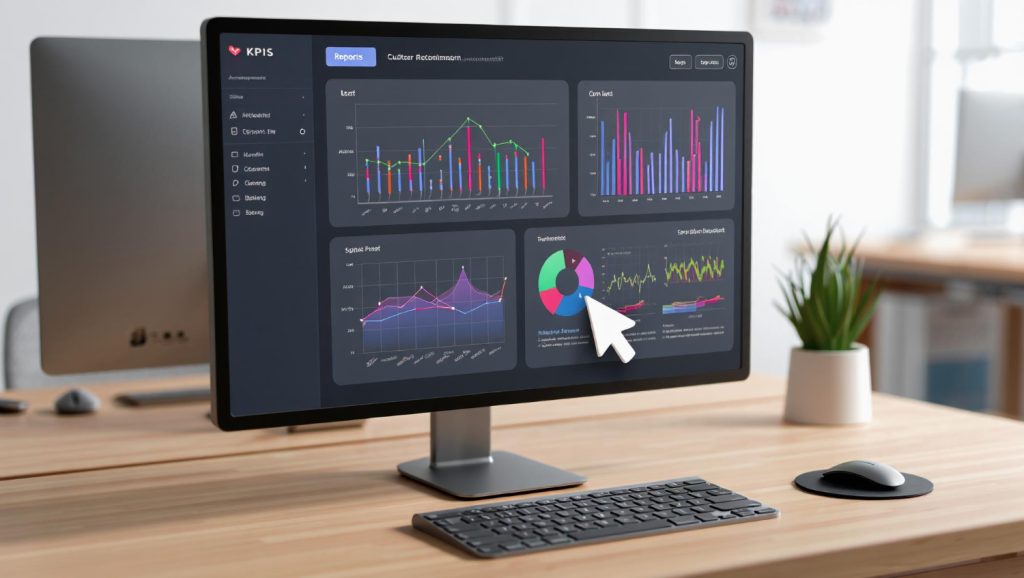
Most dashboards are graveyards of charts that nobody acts on. I’ve reviewed hundreds of analytics dashboards over the past 12 years, and the pattern is always the same: 15 widgets showing pageviews, sessions, and bounce rates, but nothing that tells anyone what to actually do. The problem isn’t the tool — it’s the KPIs. Choosing the right dashboard KPIs is the difference between a dashboard that drives decisions and one that just generates PDFs nobody reads.
Let’s fix that. This guide covers how to select KPIs that lead to action, how to design dashboards for different audiences, and how to avoid the vanity metrics trap that derails most reporting efforts.
What Makes a KPI Actionable?
A KPI (Key Performance Indicator) should do one thing: tell you whether to change course or stay the path. If a number goes up or down and nobody’s response changes, it’s not a KPI — it’s decoration.
Actionable KPIs share three traits:
- They’re tied to a goal. Every KPI maps to a specific business objective. “Increase free trial signups by 15% in Q2” gives context that raw signup numbers don’t.
- They have a threshold. You know what “good” and “bad” look like. A conversion rate of 3.2% means nothing without knowing your target is 4%.
- They suggest a response. When the number moves, the team knows what lever to pull. If organic traffic drops 20%, the SEO team investigates. If cart abandonment spikes, the UX team digs in.
One thing I always tell clients: if you can’t finish the sentence “When this KPI drops below X, we will ___,” then it doesn’t belong on your dashboard.
Vanity Metrics vs. Actionable KPIs
The distinction matters more than most teams realize. Vanity metrics feel good in reports but don’t inform decisions. Actionable KPIs might not look impressive in a slide deck, but they move the business forward.
| Vanity Metric | Why It Misleads | Actionable Alternative |
|---|---|---|
| Total pageviews | Doesn’t indicate engagement or value | Engaged sessions per user |
| Social media followers | Follower count doesn’t equal business impact | Social-attributed conversions |
| Total registered users | Includes inactive and churned accounts | Monthly active users (MAU) |
| Email list size | Large lists with low engagement hurt deliverability | Email-attributed revenue per send |
| Raw traffic volume | More traffic doesn’t mean more revenue | Revenue per session |
| Time on page (average) | Skewed by outliers and tab-hoarders | Content completion rate |
This doesn’t mean you should never look at pageviews or traffic. It means they shouldn’t be key performance indicators — the numbers your team rallies around. Understanding which website metrics actually matter is the first step toward a dashboard that earns its screen space.
How to Choose KPIs: The RACE Framework
I’ve seen dozens of KPI frameworks, and the one I keep coming back to is RACE — not because it’s trendy, but because it maps cleanly to how most businesses actually operate. RACE stands for Reach, Act, Convert, Engage, and each stage has its own set of meaningful KPIs.
Reach: Are You Getting Found?
Reach KPIs measure your ability to attract the right audience. The emphasis is on right — volume without relevance is just noise.
- Organic search click-through rate (CTR) — Are your listings compelling enough to earn clicks?
- New visitor rate by channel — Which channels bring fresh audiences?
- Share of search — How visible are you compared to competitors for your target keywords?
Act: Are Visitors Taking First Steps?
Act KPIs capture micro-conversions — the small steps that indicate interest before a full conversion happens.
- Content engagement rate — What percentage of visitors read, scroll, or interact beyond the landing page?
- Product page views per session — Are shoppers browsing your catalog?
- Lead magnet download rate — Are visitors interested enough to exchange their email for your content?
Convert: Are They Completing the Goal?
Conversion KPIs are the ones most teams focus on, and rightly so. But make sure you’re measuring the right types of conversion rate for your business model.
- Macro conversion rate — The primary goal: purchases, signups, demo requests.
- Revenue per visitor (RPV) — Combines traffic quality and conversion effectiveness into one number.
- Cost per acquisition (CPA) — What you’re paying for each conversion, by channel.
Engage: Are Customers Coming Back?
Engage KPIs measure retention and loyalty — the metrics most dashboards ignore entirely.
- Return visitor rate — What percentage of users come back within 30 days?
- Customer lifetime value (CLV) — How much revenue does each customer generate over time?
- Net Promoter Score (NPS) — Would your customers recommend you?
Designing Dashboards for Different Stakeholders
Here’s where most dashboard projects go wrong: one dashboard for everyone. Executives don’t need the same view as campaign managers. A dashboard should answer the questions its audience actually asks, and those questions vary wildly by role.
Executive Dashboard
Executives need the 30,000-foot view. They’re asking: “Are we on track to hit our goals?” and “Where should we invest more or pull back?”
Include:
- Revenue vs. target (with trend line)
- Customer acquisition cost (CAC) by channel
- Monthly active users or customer count
- Conversion rate vs. previous period
- Top 3 performing and underperforming channels
Design principles:
- 5-7 KPIs maximum — ruthless prioritization
- Big numbers with directional indicators (up/down arrows, red/green)
- Comparison to target or previous period, always
- Weekly or monthly granularity — daily noise is distracting at this level
Marketing Dashboard
Marketers need to understand channel performance and campaign effectiveness. They’re asking: “What’s working, what’s not, and where should I shift budget?”
Include:
- Traffic by channel with conversion rates
- Campaign performance (spend, conversions, CPA, ROAS)
- Landing page performance by conversion rate
- Funnel progression rates (visit > lead > MQL > SQL)
- Content performance by engagement metrics
Design principles:
- Channel comparison tables and charts
- Drill-down capability from channel to campaign to ad
- Daily or weekly granularity
- Budget utilization indicators
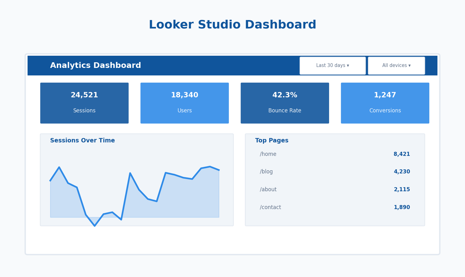
If you’re building this in Looker Studio, use scorecards with comparison periods for the top-level metrics and filterable tables for the campaign details.
Product Dashboard
Product teams need to understand user behavior and feature adoption. They’re asking: “Are users finding value, and where are they getting stuck?”
Include:
- Feature adoption rate (% of users using key features)
- User activation rate (% completing onboarding milestones)
- Task completion rate for core workflows
- Error rates and performance metrics
- User retention cohorts (day 1, day 7, day 30)
Design principles:
- Cohort-based views rather than aggregate averages
- Funnel visualizations for multi-step flows
- Segmentation by user type or plan tier
- Weekly or biweekly review cadence
The KPI Selection Process
Choosing KPIs shouldn’t happen in a vacuum. Here’s the process I walk teams through:
- Start with business objectives. What are the company’s top 3-5 goals this quarter? Every KPI should trace back to one of these.
- Identify the levers. For each objective, ask: “What inputs can we control that affect this outcome?” Those inputs become your leading indicators.
- Set thresholds. Define what good, acceptable, and concerning look like for each KPI. Use historical data and industry benchmarks — not gut feelings.
- Assign ownership. Every KPI needs an owner. If nobody’s responsible for moving the number, it won’t move.
- Define the review cadence. Some KPIs need daily monitoring (ad spend, error rates). Others are weekly or monthly (CLV, NPS). Match the cadence to how quickly the number can change.
The Leading vs. Lagging Balance
Every dashboard should mix leading indicators (predictive, controllable) with lagging indicators (outcomes, historical). A dashboard with only lagging indicators tells you what happened but not why — or what’s coming next.
| Type | Characteristic | Examples |
|---|---|---|
| Leading | Predictive, controllable, early signal | Pipeline value, trial signups, content engagement rate |
| Lagging | Outcome-based, historical, confirms results | Revenue, churn rate, customer lifetime value |
Aim for a 60/40 split: 60% leading indicators that help you course-correct, 40% lagging indicators that confirm whether your strategy worked. According to Bernard Marr’s KPI research, organizations that balance leading and lagging indicators are significantly more likely to hit their targets.
Real-World KPI Framework Examples
Let me share two KPI frameworks I’ve implemented for real teams (details changed for privacy).
Example 1: SaaS Company
A B2B SaaS company with a free trial model. Their old dashboard had 22 charts. We cut it to 8 KPIs across two dashboards.
Executive dashboard (monthly):
- Monthly Recurring Revenue (MRR) vs. target
- Net Revenue Retention Rate
- Customer Acquisition Cost (CAC) payback period
- Trial-to-paid conversion rate
Growth team dashboard (weekly):
- Trial signups by channel
- Activation rate (completed 3 key actions within 7 days)
- Feature adoption for top 5 features
- Support ticket volume per cohort
The key insight: trial signups (leading) predicted MRR growth (lagging) with a 6-week delay. Once the team saw this relationship, they knew exactly which number to watch and which lever to pull.
Example 2: Ecommerce Brand
A D2C ecommerce brand spending heavily on paid acquisition. They were optimizing for ROAS on individual campaigns but missing the bigger picture.
Executive dashboard (weekly):
- Revenue per visitor (RPV) by channel
- Blended CAC (all channels combined)
- Repeat purchase rate (30-day)
- Gross margin after shipping and returns
Marketing dashboard (daily):
- Ad spend vs. daily revenue target
- New customer vs. returning customer revenue split
- Cart abandonment rate by device
- Email revenue per send
The breakthrough: by tracking blended CAC rather than per-channel ROAS, they discovered their Facebook ads were cannibalizing organic conversions. Cutting Facebook spend by 30% barely dented total revenue but improved profitability significantly.
Avoiding Common Dashboard Pitfalls
I’ve seen these mistakes enough times to call them patterns:
- Too many KPIs. If your dashboard has more than 10 KPIs, it’s not a dashboard — it’s a report. Dashboards are for fast decisions. Cut ruthlessly. As the Digital Marketing and Measurement Model by Avinash Kaushik suggests, start with business objectives and work backward to the minimum metrics needed.
- No context for numbers. A conversion rate of 2.4% is meaningless without comparison. Always show KPIs alongside a target, previous period, or benchmark.
- One dashboard for all audiences. I covered this above, but it’s worth repeating. Build role-specific views or you’ll satisfy nobody.
- Ignoring data quality. A beautiful dashboard built on unreliable tracking is worse than no dashboard at all. Before obsessing over visualization, make sure your conversion tracking and event data are solid.
- Set-it-and-forget-it. Review your KPIs quarterly. Business priorities shift, and your dashboard should shift with them. A KPI that mattered in Q1 might be irrelevant by Q3.
Making Your Dashboard Drive Action
The ultimate test of a dashboard is whether it changes behavior. Here are three practices that bridge the gap between “looking at data” and “acting on it”:
- Add annotations. When a KPI spikes or drops, note why directly on the dashboard. “Launched new pricing page 3/15” next to the conversion rate chart turns data into narrative.
- Set alerts. Don’t wait for someone to check the dashboard. Configure alerts when KPIs cross your defined thresholds. If cart abandonment exceeds 75%, the right people should know immediately.
- Build in the next step. Every dashboard section should answer “so what?” If organic traffic dropped, the dashboard should link to (or display) the breakdown by landing page so the team can diagnose quickly.
The best dashboards I’ve built aren’t the prettiest — they’re the ones where teams open them every morning and make decisions within five minutes. That’s the benchmark. Choose your KPIs with that standard in mind, and your dashboards will finally earn their keep.
Written by Alicia Bennett
Lead Web Analyst based in Toronto with 12+ years in digital analytics. Specializing in privacy-first tracking, open-source tools, and making data meaningful.
More about Alicia →Related Articles
Automated Reporting Workflows: From Raw Data to Stakeholder Insights
You’re spending hours every week copying data into spreadsheets, formatting charts, and emailing reports that stakeholders skim for thirty seconds.…
Google Looker Studio for Beginners: Create Your First Analytics Dashboard
What Is Looker Studio (And Why Use It)? Looker Studio (formerly Google Data Studio) is Google’s free dashboard and reporting…