Automated Reporting Workflows: From Raw Data to Stakeholder Insights
You’re spending hours every week copying data into spreadsheets, formatting charts, and emailing reports that stakeholders skim for thirty seconds. I’ve watched teams burn entire mornings on this cycle. The fix isn’t working faster — it’s building automated reporting workflows that handle the grunt work while you focus on analysis.
In this guide, I’ll walk you through building a reporting pipeline from scratch. You’ll learn how to schedule data pulls, transform raw numbers into meaningful insights, design templates that stakeholders actually read, and distribute reports without lifting a finger.
Why Manual Reporting Doesn’t Scale
Manual reporting breaks down in predictable ways. When you’re pulling data from three platforms, formatting it in a spreadsheet, and emailing it to five stakeholders, you’re creating a process that depends entirely on you showing up and doing it right every single time.
I’ve seen teams where one person’s vacation means two weeks of missing reports. That’s not a workflow — it’s a bottleneck. Automated reporting eliminates human error, guarantees consistency, and frees your time for work that actually requires a brain.
The goal isn’t to remove humans from reporting. It’s to remove humans from the repetitive parts so you can spend more time on interpretation and recommendations.
Step 1: Map Your Data Sources and Metrics
Before you automate anything, document exactly what goes into each report. I can’t stress this enough — most failed automation projects skip this step and end up rebuilding from scratch.
Start with a simple inventory:
- Data sources: Where does each metric come from? (Analytics platform, CRM, ad platforms, search console)
- Metrics: What specific numbers do stakeholders need? Strip out vanity metrics — focus on the metrics that actually matter for decisions.
- Frequency: Daily, weekly, monthly? Different stakeholders often need different cadences.
- Format: Dashboard, PDF, email summary, spreadsheet?
Here’s a template I use when scoping automated reports:
| Report | Audience | Frequency | Data Sources | Key Metrics | Delivery |
|---|---|---|---|---|---|
| Executive Summary | C-suite | Weekly | Analytics, CRM | Revenue, conversions, traffic trends | Email PDF |
| Marketing Performance | Marketing team | Weekly | Analytics, Ads, Search Console | Channel traffic, CTR, cost per acquisition | Dashboard + email |
| Content Report | Content team | Monthly | Analytics, Search Console | Page views, engagement, keyword rankings | Spreadsheet |
| Technical Health | Dev team | Daily | Analytics, uptime monitor | Page speed, errors, Core Web Vitals | Slack notification |
Step 2: Set Up Scheduled Data Extraction
Once you’ve mapped your sources, you need a reliable way to pull data on a schedule. There are several approaches depending on your technical comfort level.
Google Sheets + Add-ons (Low Code)
For many teams, Google Sheets is the simplest starting point. Add-ons like Supermetrics or the free Google Analytics Spreadsheet Add-on let you schedule data pulls directly into a spreadsheet.
Set up a “raw data” tab that refreshes automatically, then build your report tabs with formulas that reference it. The key is separating data ingestion from data presentation — never mix them in the same sheet.
// Example: Google Apps Script scheduled trigger
function pullWeeklyData() {
  var sheet = SpreadsheetApp.getActiveSpreadsheet().getSheetByName('RawData');
  var today = new Date();
  var lastWeek = new Date(today.getTime() - 7 * 24 * 60 * 60 * 1000);

  // Pull data from your analytics API
  var response = UrlFetchApp.fetch('https://your-analytics-api/v1/stats?' +
    'start=' + formatDate(lastWeek) +
    '&end=' + formatDate(today));

  var data = JSON.parse(response.getContentText());
  // Write to sheet...
}

// Set this to run every Monday at 6 AM
// Triggers > Add Trigger > Time-driven > Week timer
Looker Studio Scheduled Reports (No Code)
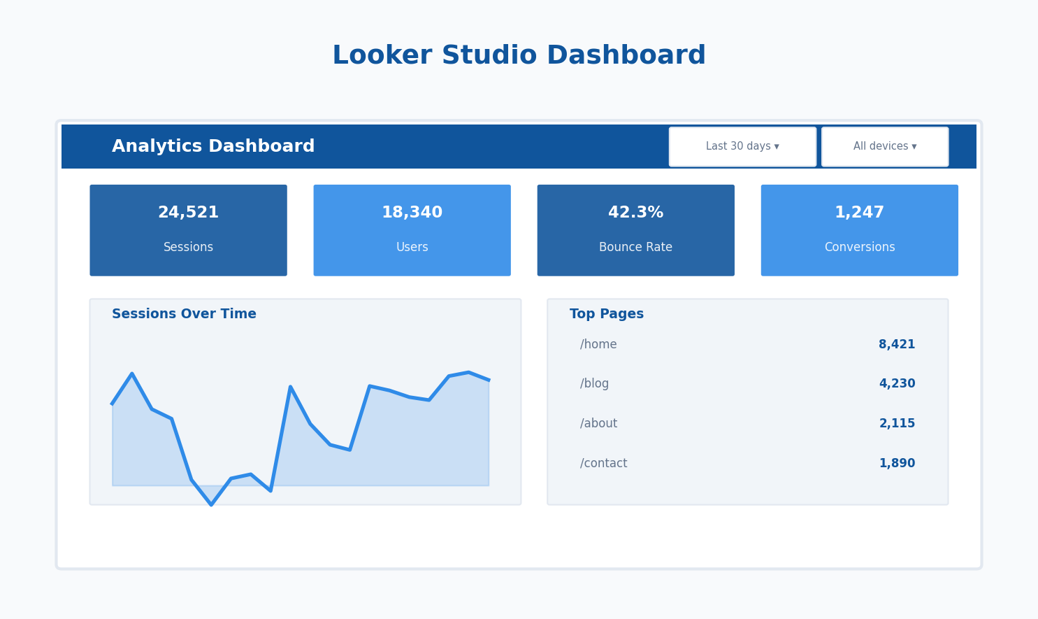
If you’re already using Looker Studio for dashboards, you can schedule email delivery of any report. Navigate to Share > Schedule email delivery, set your frequency, and add recipients. The report arrives as an interactive link or PDF attachment.
This works well for recurring snapshots, but it’s limited — you can’t customize the email body or add conditional logic.
API + Script Automation (Full Control)
For complex pipelines, a scheduled script gives you complete control. Python with cron or a cloud function on a timer can pull from any API, transform data however you need, and push results to any destination.
# Example: Python data extraction cron job
import requests
import datetime

def extract_analytics_data():
    end_date = datetime.date.today()
    start_date = end_date - datetime.timedelta(days=7)

    # Pull from your analytics platform's API
    response = requests.get(
        'https://your-analytics-platform/api/v1/stats',
        params={
            'start': start_date.isoformat(),
            'end': end_date.isoformat(),
            'metrics': 'pageviews,sessions,conversions'
        },
        headers={'Authorization': 'Bearer YOUR_TOKEN'}
    )

    return response.json()

# Schedule with cron: 0 6 * * 1 python3 /scripts/weekly_report.py
Step 3: Transform Raw Data Into Insights
Raw numbers aren’t a report. Stakeholders don’t want to see that you had 14,327 sessions last week — they want to know if that’s good, bad, or expected. The transformation layer is where automated reporting goes from “data dump” to “useful.”
Build these calculations into your pipeline:
- Period-over-period comparison: Always show current vs. previous period (week-over-week, month-over-month)
- Percentage change: “+12% vs. last week” is instantly understandable
- Benchmarks: Flag when metrics fall outside normal ranges
- Trend direction: A simple up/down arrow communicates more than a raw number
When you’re pulling data across channels, the transformation step is also where you normalize things. Different platforms count sessions, users, and conversions differently. Your cross-channel analytics setup should handle reconciliation before numbers hit the report.
Building Conditional Alerts
One of the most valuable additions to any automated report is conditional logic. Instead of just delivering numbers, flag anomalies:
// Google Apps Script: conditional formatting for reports
function flagAnomalies(currentValue, previousValue, threshold) {
  var percentChange = ((currentValue - previousValue) / previousValue) * 100;

  if (Math.abs(percentChange) > threshold) {
    return {
      value: currentValue,
      change: percentChange.toFixed(1) + '%',
      alert: true,
      message: percentChange > 0 ? '⚠ Significant increase' : '⚠ Significant decrease'
    };
  }

  return { value: currentValue, change: percentChange.toFixed(1) + '%', alert: false };
}
I’ve found that a 20% threshold works well for weekly traffic reports. Adjust based on your data’s normal volatility.
Step 4: Design Report Templates That Get Read
I’ve spent 12 years watching people ignore reports. The ones that get read share three traits: they’re short, they lead with the headline, and they tell the reader what to do.
Structure every automated report like this:
- Executive summary (2-3 sentences): What happened this period? What’s the one thing they should know?
- Key metrics table: 5-8 metrics max, with period comparison and trend arrows
- Highlights and alerts: What’s significantly up, down, or broken?
- Recommendations (optional): For weekly reports, include 1-2 suggested actions
- Detailed data: Link to the full dashboard for anyone who wants to dig deeper
Keep the emailed portion scannable in under 60 seconds. The Nielsen Norman Group’s research on reading patterns confirms that people scan rather than read — design for that behavior.
Template Tools
| Tool | Best For | Difficulty | Cost |
|---|---|---|---|
| Google Sheets + Apps Script | Custom calculations, flexible formatting | Medium | Free |
| Looker Studio | Visual dashboards, interactive reports | Low | Free |
| Python + Jinja2 | HTML email reports, full customization | High | Free |
| Databox | Mobile-friendly scorecards | Low | Paid |
Step 5: Automate Distribution
The final piece is getting reports to the right people without manual intervention. Your distribution method should match the audience’s habits.
Email Distribution
Email remains the most reliable channel for report distribution. For Google Sheets-based reports, Apps Script can generate a PDF and email it automatically:
function emailWeeklyReport() {
  var spreadsheet = SpreadsheetApp.getActiveSpreadsheet();
  var reportSheet = spreadsheet.getSheetByName('Report');

  // Generate PDF of the report tab
  var url = spreadsheet.getUrl().replace(/edit.*$/, '') +
    'export?format=pdf&gid=' + reportSheet.getSheetId();

  var pdf = UrlFetchApp.fetch(url, {
    headers: { Authorization: 'Bearer ' + ScriptApp.getOAuthToken() }
  });

  // Send email
  MailApp.sendEmail({
    to: 'stakeholders [at] company.com',
    subject: 'Weekly Analytics Report — ' + Utilities.formatDate(new Date(), 'EST', 'MMM d, yyyy'),
    htmlBody: '<p>Hi team, attached is this week\'s analytics summary.</p>' +
              '<p>Key highlight: [auto-generated summary]</p>',
    attachments: [pdf.getBlob().setName('weekly-report.pdf')]
  });
}
Slack or Teams Integration
For teams that live in messaging tools, push a summary directly to a channel using a Slack incoming webhook or similar integration. Keep these short — a few key metrics and a link to the full report.
Dashboard Links
For interactive reports, send a link rather than a static file. Looker Studio, Grafana, and similar tools let you set date ranges via URL parameters, so you can link directly to the relevant time period.
Common Pipeline Architectures
After building dozens of these, I’ve found three patterns that cover most use cases:
| Pattern | Stack | Best For | Maintenance |
|---|---|---|---|
| Simple | Google Sheets + Scheduled Add-on + Email | Small teams, single data source | Low |
| Visual | Looker Studio + Scheduled Email | Stakeholders who need charts and interactivity | Low |
| Custom | Python/Node + API + HTML Email Template | Multiple sources, complex transformations, conditional logic | Medium-High |
Start with the simplest pattern that meets your needs. You can always upgrade later — and a simple pipeline that actually runs is infinitely better than a complex one that’s still “in progress.”
Testing and Maintaining Your Pipeline
Automated doesn’t mean unattended. Build these safeguards into your workflow:
- Validation checks: Compare row counts and totals against source systems. If your report shows zero sessions on a Tuesday, something’s broken.
- Error notifications: If a data pull fails, you should know immediately — not when a stakeholder asks why the report is missing.
- Monthly review: Are the metrics still relevant? Has a data source changed its API? I schedule 30 minutes monthly to review each pipeline.
- Documentation: Write a one-page runbook for each pipeline. When you leave for vacation, someone else should be able to troubleshoot without calling you.
Debugging Checklist
When a pipeline breaks (and it will), check these in order:
- Authentication: API tokens expire. This is the most common failure point.
- Data source changes: Did the API version change? Did a field get renamed?
- Rate limits: Are you hitting API rate limits, especially during batch pulls?
- Schema changes: Did someone add or remove columns in the source data?
- Timezone mismatches: Different platforms use different default timezones, which can cause data to appear missing.
Scaling Your Automated Reporting
Once your first pipeline is running reliably, you’ll want more. Here’s how to scale without creating a maintenance nightmare:
Standardize your stack. Pick one approach and use it consistently. If Google Sheets works for your marketing report, use it for your sales report too. Maintaining five different pipeline architectures is a fast track to burnout.
Build modular components. Create reusable functions for data extraction, transformation, and delivery. When your next report needs data from the same API, you shouldn’t be writing the same authentication code again.
Version control your scripts. Even simple Apps Script projects deserve a Git-backed workflow. When something breaks after a change, you need to know what changed.
Automated reporting isn’t a one-time project — it’s an evolving system. Start small, validate that it delivers value, and expand from there. The best pipeline is the one that runs every week without you thinking about it, and gives your stakeholders the numbers they need to make decisions.
Written by Alicia Bennett
Lead Web Analyst based in Toronto with 12+ years in digital analytics. Specializing in privacy-first tracking, open-source tools, and making data meaningful.
More about Alicia →Related Articles
Dashboard KPIs That Drive Decisions, Not Just Reports
Most dashboards are graveyards of charts that nobody acts on. I’ve reviewed hundreds of analytics dashboards over the past 12…
Google Looker Studio for Beginners: Create Your First Analytics Dashboard
What Is Looker Studio (And Why Use It)? Looker Studio (formerly Google Data Studio) is Google’s free dashboard and reporting…